Case Study
How We Translated the Feel of Silk, Tradition, and Craft Into a Modern, Scalable Logo
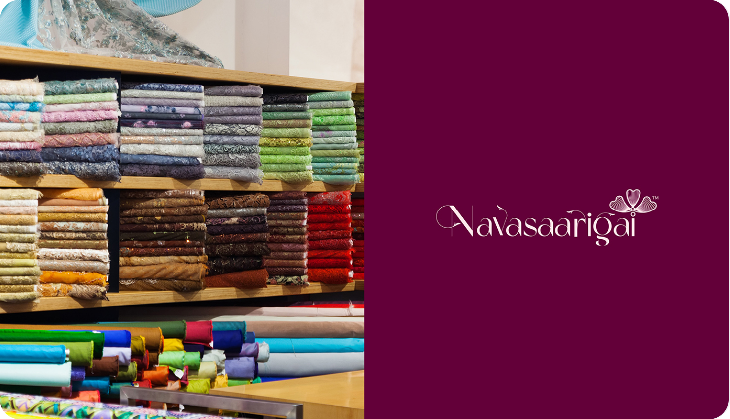
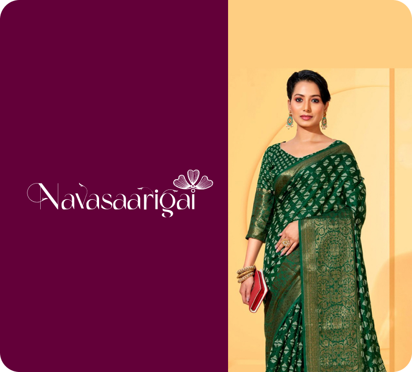
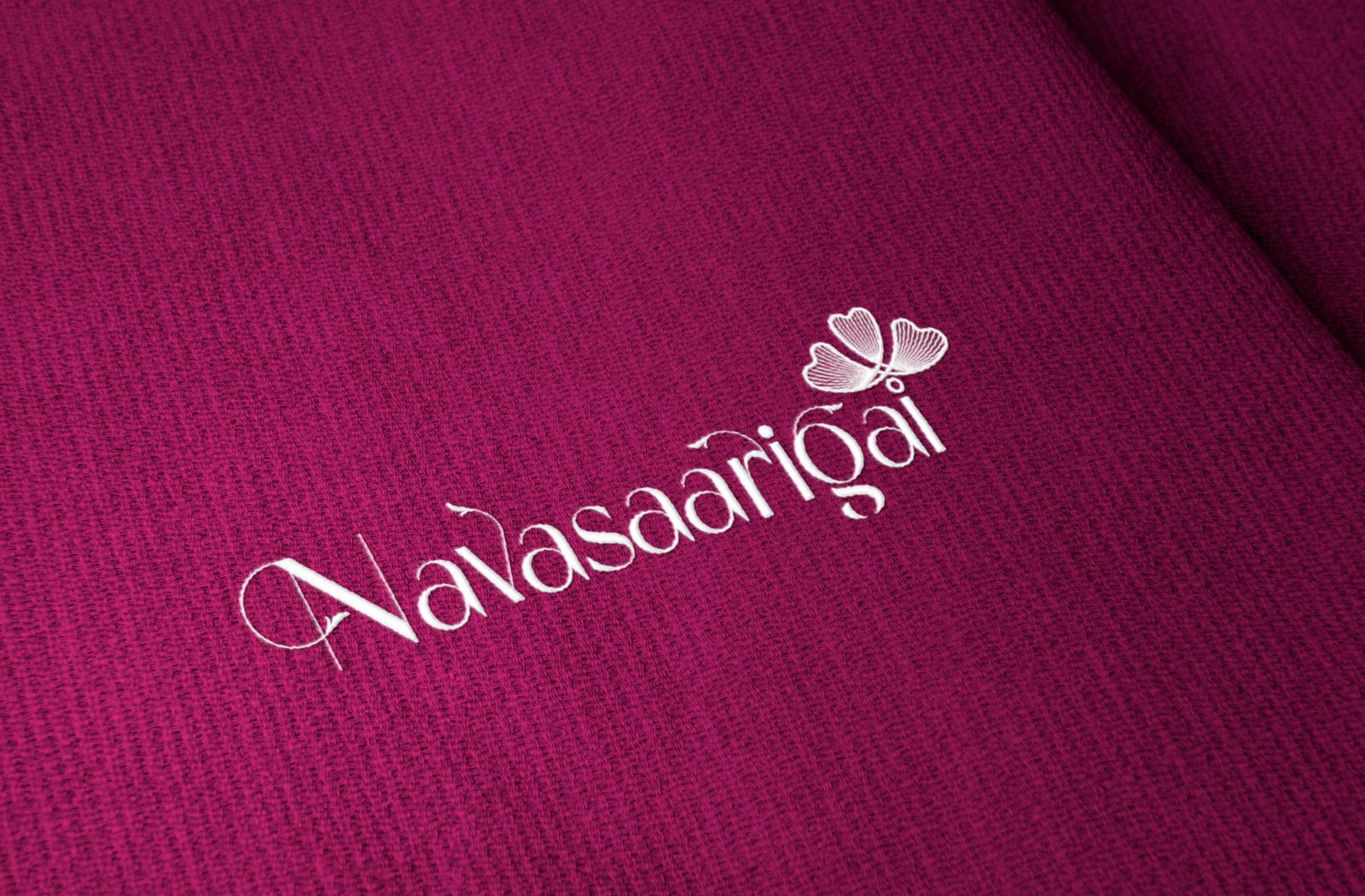
About the Navasaarigai
A silk weavers association from Arani — a region deeply rooted in traditional silk weaving.
- Preserve heritage
- Expand into modern markets
- Introduce silk beyond sarees — including men’s wear
With increasing volume, they needed a structured system to manage operations efficiently.
Problem
They didn’t just need a logo.
They needed an identity that:
- Reflects the softness and richness of silk
- Represents traditional weaving culture
- Doesn’t feel overly feminine
- Supports expansion into broader product categories
- Feels both heritage-driven and contemporary
The Real Issue
Silk is not just a product.
It’s a feeling, a process, and a legacy —
and that needed to be visualized.
Challenge
This wasn’t a design problem.
It was a translation problem.
It was a We had to convert:
- Texture → into visual form
- Softness → into typography
- Tradition → into subtle elements
- Culture → into a modern identity
Approach
We didn’t start with design.
We started with understanding silk itself.
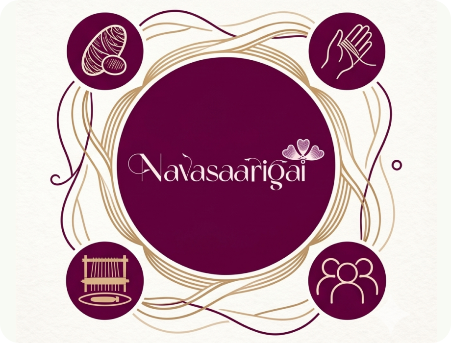
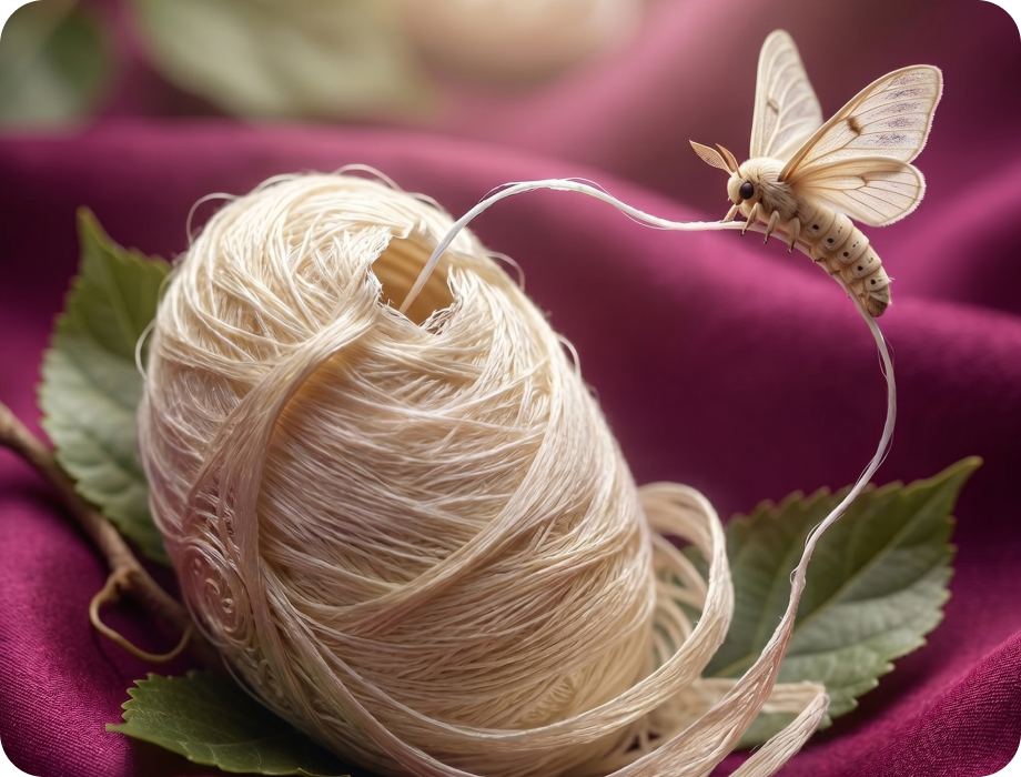
1. Cultural & Material Research
- Studied traditional weaving techniques
- Understood the lifecycle of silk:
- Cocoons
- Threads
- Fabric formation
- Referred to historical materials and local insights
- Interacted with people connected to the craft
This ensured the logo is rooted in authenticity.
Logo Direction
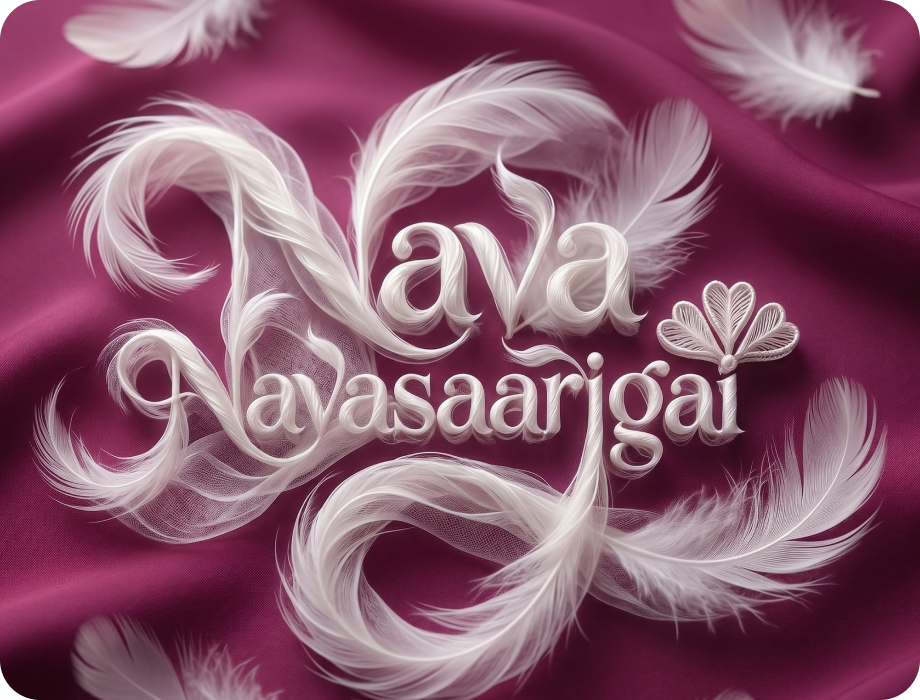
2. Softness as Form
- Typography designed with:
- Smooth curves
- Flowing strokes
Reflects:
- Feather-like softness
- Gentle silk movement
3. Cocoon & Transformation Motif
- Visual elements inspired by:
- Silk cocoons
- Organic forms
Symbolizes:
- Origin of silk
- Natural transformation
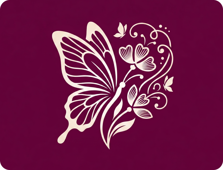
4. Butterfly & Nectar Influence
- Subtle inspiration from:
- Butterfly wings
- Nectar flow
Represents:
- Lightness
- Elegance
- Natural beauty
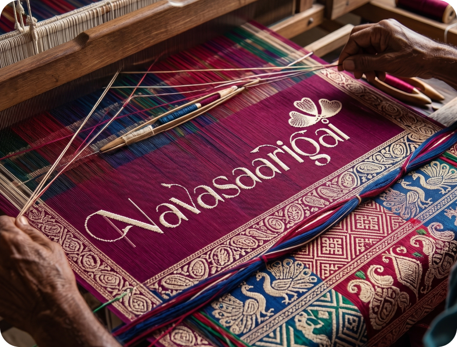
5. Weaving Culture Integration
- Incorporated elements inspired by:
- Traditional weaving patterns
- Thread interconnections
Adds:
- Cultural depth
- Craft authenticity
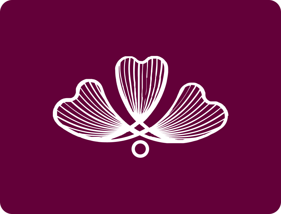
6. Gender-Neutral Balance
- Avoided overly decorative or feminine styling
- Maintained:
- Elegance
- Structure
Ensures adaptability for:
- Sarees
- Men’s shirts
- Future product lines
What We Delivered
Logo design rooted in cultural research
Typography inspired by silk flow
Symbolic elements (cocoon, butterfly, threads)
Balanced identity for broader audience
Scalable design for multiple product categories
Outcome
Navasaarigai didn’t just get a logo.
They got:
visual identity that carries meaning
The Shift
From generic identity

culturally rooted brand
From visual design
emotional representation
From product-based
experience-based identity
Business Impact
- Strong connection to heritage
- Premium and elegant perception
- Flexible for future expansion
- Unique identity in textile space
- Immediate association with silk softness
 Good design shows.
Great design feels.