

Case Study
How We Positioned SVG Areca as a Premium, Export-Quality Brand in a Commodity Market
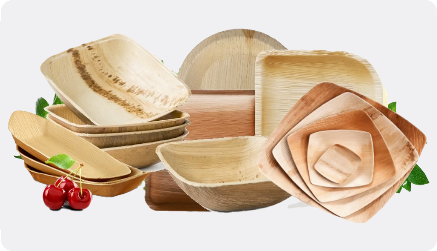
About the SVG Areca Plates
A manufacturer of areca palm plates aiming to position themselves as:
Export-quality, premium-grade products
— not just another local supplier
Problem
The market was saturated with similar-looking products.
Most competitors:
- Used generic green “eco” visuals
- Focused only on price
- Lacked clear differentiation
Even high-quality manufacturers were perceived as:
“just another plate supplier”
The Real Issue
The product was premium.
But the visual and brand perception was generic.
Challenge
We needed to:
- Break away from generic eco-branding
- Create a premium, export-ready perception
- Maintain simplicity while elevating elegance
- Build trust through visual authenticity
- Ensure consistency across all touchpoints
Solution
We built a complete brand positioning and visibility system — centered around authenticity, minimalism, and material truth.
Brand & Website Direction
1. Brand Positioning
- Positioned clearly as:
Areca Plate Manufacturers (not traders) - Focused on:
- Export quality
- Consistency
- Material authenticity
Built authority and clarity
2. Color Strategy (Key Differentiator)
Instead of typical green eco-branding, we used:
Earthen tones inspired by actual areca palm color
- Natural beige
- Warm browns
- Subtle organic tones
Result:
- Feels real, not artificial
- Reflects the actual product
- Creates a premium, grounded aesthetic
3. Brand Identity System
- Minimal, clean typography
- Soft, balanced layouts
- No visual noise
Created a brand that feels:
simple, elegant, and export-ready
4. Business Card (Material-Led Branding)
- Designed on kraft paper
- Reinforces:
- Eco values
- Authenticity
- Premium minimalism
Physical touchpoint aligns with brand story
5. Packaging System
- Clean and structured packaging
- Clear information on:
- Sizes
- Pricing
- Product details
Packaging becomes:
communication + positioning tool
6. Website Experience
- Designed to avoid generic templates
- Focused on:
- Clean structure
- Product clarity
- Premium feel
Every section reflects:
quality + innovation + simplicity
What We Delivered
Brand positioning strategy
Complete brand identity kit
Earthen-tone color system (areca-based palette)
Kraft paper business card
Packaging design system
Website (design + development)
Unified brand communication
Outcome
SVG Areca didn’t just get branding.
They got:
A distinct premium identity in a crowded market
The Shift
From generic eco-brand

authentic premium brand
From green clichés
material-inspired identity
From product focus
perception-driven positioning
Business Impact
- Strong differentiation from competitors
- Premium perception aligned with export quality
- Better visual recall
- Consistent identity across all touchpoints
- Increased trust in product quality
 When the product is natural,
the branding should feel natural too.